Skybound
Welcome to Skybound Insiders, the free VIP group for lovers of comics and entertainment!

Forgot Password?
Or
Fb Connect
Welcome to Skybound Insiders, the free VIP group for lovers of comics and entertainment!

Login
Creating an account means you're okay with Skybound's Terms of Service, Privacy Policy
 
Skybound
Welcome to Skybound Insiders, the free VIP group for lovers of comics and entertainment!

Or
Cancel
Fb Connect
Creating an account means you're okay with Skybound's Terms of Service, Privacy Policy
 
Skybound
Almost complete! You will now receive a confirmation email for your registration, please click the link in that email to finish the registration process and claim your comic rewards.
Skybound Entertainment
  • About
  • Comics
  • Games
  • TV / Movies
  • Podcasts
  • Shop
The Walking Dead
Invincible
Skybound Insiders
Nothing Found
View All Search Results
  • The Walking Dead
  • Comic
    • Latest
    • Story
    • Characters
  • Show
    • Latest
    • Story
    • Characters
  • Games
  • Fear TWD
    • Latest
    • Story
    • Characters
  • Galleries
  • Videos
Skybound Entertainment
  • Account
  • Logout
Nothing Found
View All Search Results

New Dress for TWD #127

April 29, 2014
Lizzy IversonbyLizzy Iverson
in Comics
Reading Time: 1 min read
89
20
SHARES
FacebookTwitterRedditQREmail

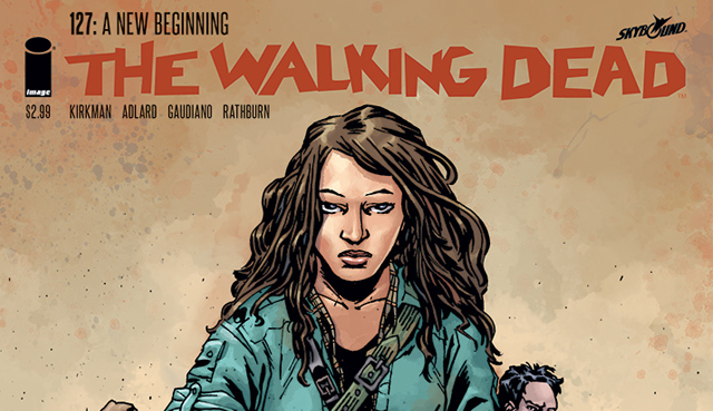
The Walking Dead has had a fairly unified style since its first issue. The bold logo was switched up recently at the beginning of the “All Out War” arc with The Walking Dead #115, and now, with Issue #127, the trade dress is getting another makeover.

Here’s The Walking Dead #127 with its new, more modern design. What do you think of the new logo? Of the arc title listed along the top? Which of the three logos do you like the most?

TWD127_p1

Become a Shareholder in the Skybound Universe!
Announcements

Become a Shareholder in the Skybound Universe!

by DWelch
January 23, 2023

POPULAR

  • The Walking Dead Definitive Series’ Lee and Clem Statue Update

    The Walking Dead Definitive Series’ Lee and Clem Statue Update

    459 shares
    Share 184 Tweet 115
  • The Walking Dead Season 9 Episode 15: Comic vs. Show

    11192 shares
    Share 4380 Tweet 2738
  • The Top 10 Carl Grimes Moments From The Walking Dead

    780 shares
    Share 312 Tweet 195
  • Launching the INVINCIBLE TRAINEE PROGRAM

    424 shares
    Share 170 Tweet 106
  • Lee and Clementine Telltale Statue Production Update

    1277 shares
    Share 511 Tweet 319

SkyboundShop

Recommended from the SKYBOUND shop


Tags: A New BeginningAll Out WarComicsCoversIssue 127TWD

Home | The Walking Dead | New Dress for TWD #127

Previous

Series 6 Minimates on the way!

Next

Norman Reedus on Season 5

Related Posts

Invincible Collectible Art Print
Announcements

Grab These Walking Dead and Invincible Collectible Art Prints This Week at PAX East!

by Joe McCabe
3 hours ago
0

If you’re one of the lucky Skybounders headed for PAX East this week, then you need to get yourself to the Skybound booth (#12055), stat! As we mentioned in our...

Your First Look at the Return of Joshua Williamson’s Dark Ride!
Announcements

Your First Look at the Return of Joshua Williamson’s Dark Ride!

by Joe McCabe
4 days ago
0

Heads up, horror hounds! We've got your first look at the second arc of writer Joshua Williamson and Andrei Bressan's hit horror comic Dark Ride. Check out the official deets from...

First Look: Kroma by Lorenzo De Felici Reaches Its Visceral Conclusion

First Look: Kroma by Lorenzo De Felici Reaches Its Visceral Conclusion

6 days ago
GIGI CAVENAGO VARIANT COVERS UNVEILED FOR KROMA BY LORENZO DE FELICI SERIES FINALE

GIGI CAVENAGO VARIANT COVERS UNVEILED FOR KROMA BY LORENZO DE FELICI SERIES FINALE

2 weeks ago
Graphic Novels & Comics Round Table Introduces Comics Librarian Conference Travel Grant with funding from Image Comics and Skybound Entertainment

We Chat with Graphic Novel & Comics Round Table President Moni Barrette

2 weeks ago
FIRST LOOK: IT’S SUPERNATURAL FIGHT OR FLIGHT IN I HATE THIS PLACE #7

FIRST LOOK: IT’S SUPERNATURAL FIGHT OR FLIGHT IN I HATE THIS PLACE #7

2 weeks ago

Related Posts

Invincible Collectible Art Print

Grab These Walking Dead and Invincible Collectible Art Prints This Week at PAX East!

by Joe McCabe
3 hours ago
0

If you’re one of the lucky Skybounders headed for PAX East this week, then you need to get yourself to...

Your First Look at the Return of Joshua Williamson’s Dark Ride!

Your First Look at the Return of Joshua Williamson’s Dark Ride!

by Joe McCabe
4 days ago
0

Heads up, horror hounds! We've got your first look at the second arc of writer Joshua Williamson and Andrei Bressan's hit...

First Look: Kroma by Lorenzo De Felici Reaches Its Visceral Conclusion

First Look: Kroma by Lorenzo De Felici Reaches Its Visceral Conclusion

by Joe McCabe
6 days ago
0

Kromaniacs, the wait is almost over. The fourth and final issue of Kroma by Lorenzo De Felici arrives in comic shops...

GIGI CAVENAGO VARIANT COVERS UNVEILED FOR KROMA BY LORENZO DE FELICI SERIES FINALE

GIGI CAVENAGO VARIANT COVERS UNVEILED FOR KROMA BY LORENZO DE FELICI SERIES FINALE

by Joe McCabe
2 weeks ago
0

The sci-fi fable Kroma by Lorenzo De Felici has drawn as much praise for its story about the persecution of...

Graphic Novels & Comics Round Table Introduces Comics Librarian Conference Travel Grant with funding from Image Comics and Skybound Entertainment

We Chat with Graphic Novel & Comics Round Table President Moni Barrette

by Joe McCabe
2 weeks ago
0

These days it’s just as likely new readers will discover comics through their local library as they will a bookstore...

FIRST LOOK: IT’S SUPERNATURAL FIGHT OR FLIGHT IN I HATE THIS PLACE #7

FIRST LOOK: IT’S SUPERNATURAL FIGHT OR FLIGHT IN I HATE THIS PLACE #7

by Joe McCabe
2 weeks ago
0

Since its blockbuster breakthrough The Walking Dead first dazzled comics fans, Skybound has become synonymous with supernatural horror. So it's...

Comments 89

  1. Andrew says:
    9 years ago

    I’m one of those people who like seeing the title of the on-going arc on the cover of the issues so that’s definitely a plus. I really like the new logo too and the other ones weren’t bad but with this one, we get an overall better look at the amazing cover art. I’m really digging it. They say “if it ain’t broke, don’t fix it” and the old ones weren’t “broke” but this is an improvement and a good update, imo.

    Reply
    • Zimovski says:
      9 years ago

      Agree with you. I like the new style, although nothing was wrong with the old one.

      Reply
      • Stuart Ormston says:
        9 years ago

        Agreed, am feeling the new logo, old one was a classic and always will be, but this new one is sleek and modern

        Reply
        • Zimovski says:
          9 years ago

          As long as they keep the iconic letter shape, it’s cool.

          Reply
    • Jonathon Moreau says:
      9 years ago

      I also agree with this.

      Reply
  2. Chris Pendleton says:
    9 years ago

    Looks great guys! Allows more room for the artwork!

    Reply
  3. Ryan Finn says:
    9 years ago

    I like it, I just wonder how it will translate on busier cover art. Especially the thin author & issue title text.

    Reply
    • Sean Tracy says:
      9 years ago

      TWD hasn’t had many “busy” cover art images, save maybe issue 100…

      Reply
  4. Phillip Blake says:
    9 years ago

    I’m really exited for this New Ark. Worried to Death about who these people are though.

    Reply
  5. daveleclair says:
    9 years ago

    I like it. Claimed.

    Reply
    • Stuart Ormston says:
      9 years ago

      Lol 🙂

      Reply
  6. Bastet says:
    9 years ago

    I like both… think it will take a few more issues for me to really determine which one I like better.

    Reply
  7. Jason Ferris says:
    9 years ago

    I love it just like Andrew said here you get to see more of the cover art when im reading this comic its not just the story the art is just as important to me and the covers are so important as well keep them coming I love this comic

    Reply
  8. marco says:
    9 years ago

    i don’t know yet, i need to see more issues with this logo. Does this mean you’re just gonna sell the next issues with this logo only, or with another version with the big logo ?

    Reply
  9. marco says:
    9 years ago

    I personally like the big ass logo from before issue 115 more, it was powerful, we could tell from a far distance that there is a walking dead issue with the big old logo
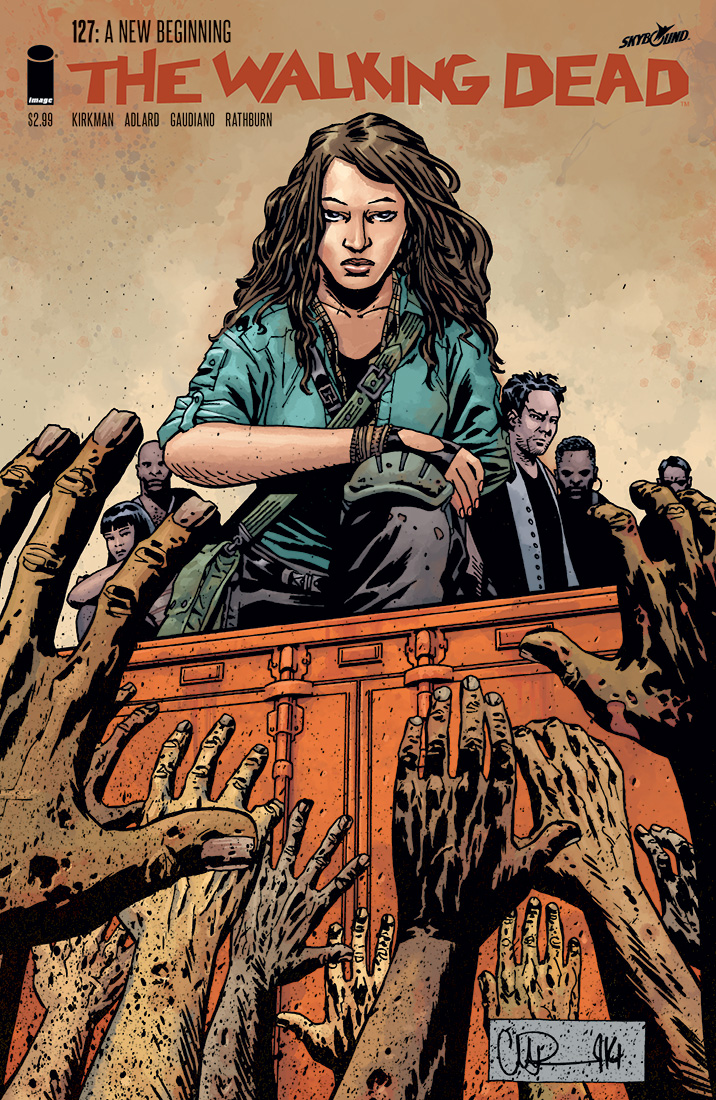
    Reply
  10. Bastet says:
    9 years ago

    Helps to compare:

    Reply
    • Bastet says:
      9 years ago

      Ol Skool:

      Reply
      • Scott P. says:
        9 years ago

        Plus I like these covers too.. the “Ol’ skool” covers are pretty awesome. the covers in All Out War were pretty good though.. Although the biggest thing I like about this new 127 cover is the arc name at the top

        Reply
      • Julian Bugliarisi says:
        9 years ago

        I like where they put the issue number in this one better than the new one

        Reply
    • marco says:
      9 years ago

      I prefer this because it has a bigger logo

      Reply
      • Bastet says:
        9 years ago

        I like this one better than I like the one below. It just fits with the whole thing.

        Reply
        • Stuart Ormston says:
          9 years ago

          Like with most change, you are going to get some people who love it andsome people who hate, me? I embrace change, keeps things fresh, like the arc title at the top and as someone else has said leave more room for the cover art.

          Reply
          • marco says:
            9 years ago

            But the logo is already perfect as it is, why change it? It is well designed and modern. The new one is too small.

          • Stuart Ormston says:
            9 years ago

            The original is a classic and always will be, i totally agree. big brands are always reiventing themselves, that will always happen, the new logo will not diminish the quality of the old log in any way, and it surley won’t make the comice any less enjoyable, so I choose to acept and embrace the new 🙂

          • Jason Thomas says:
            9 years ago

            Good post !

          • Stuart Ormston says:
            9 years ago

            One of my better moments 🙂

          • Jeremy says:
            9 years ago

            It’s hardly perfect when art work cover writing, or writing covers artwork when there is plenty of negative space to put it in where it won;t overshadow something else.

          • marco says:
            9 years ago

            But it fits well, there is no empty spaces. With this new logo there are empty spaces, everything is blank.

          • Jeremy says:
            9 years ago

            Yeah I hate when there is writing over the art work, or art work covering the logo like it is doing whee the woman’s head is in front of the word “dead”, I don’t get the point in hiding one behind the other, when you have negative space to put it in so it doesn’t take away from the artwork. Why put that work in just to cover it up?

  11. Owen De Val says:
    9 years ago

    Sorry to say but, I really don’t like this and I didn’t like the all out war style of the logo.
    The original logo was a clear block color and is instantaneously recognizable and Just generally looks good. It’s on the Comics, figures, Trade paperbacks everything comic related. Changing it for a modern look just does not feel or look right. If It ain’t broke… don’t fix it!

    Reply
    • marco says:
      9 years ago

      I agree with you, the best logos are the era before issue 115, big one-block color and volumic logo, and easily discernable.

      Reply
      • Owen De Val says:
        9 years ago

        Yes! Exactly 🙂

        Reply
    • Jonathon Moreau says:
      9 years ago

      This one… The text style is exactly the same. The words are just pressed together. Everyone would still be able to tell a TWD piece of merchandise, regardless of logo style, would know what it is.

      The change isn’t needed but it’s certainly not bad either. Doesn’t do any harm.

      Reply
  12. Matt Stevens says:
    9 years ago

    The original was better. I just don’t see what changing it does?

    Reply
    • Jeremy says:
      9 years ago

      Leaves more room for artwork and leaves writing off in the negative space. Makes perfect sense if you use your brain for once.

      Reply
      • Matt Stevens says:
        9 years ago

        So do you spend your whole life insulting the intelligence of anyone who does now agree with you? Or are you just a keyboard warrior?

        Reply
  13. Frank says:
    9 years ago

    if its not broken, dont fix it

    Reply
  14. marco says:
    9 years ago

    the big logos shows the power of the comic, a big volumic logo. It has lost some volume since issue 115, but now, it’s getting too small

    Reply
  15. marco says:
    9 years ago

    The cover of issue 129 is especially beautiful with its big logo and beautiful blue color, i don’t want to see the logos disappear

    Reply
  16. marco says:
    9 years ago

    I seriously think the old logo is the best logo. The design is great, old school, gorgeous and modern, and bad ass

    Reply
  17. ihatepeacocks.com says:
    9 years ago

    I’m not feeling the new look. But I do like that is opens up more cover space for Charlie potentially.

    Reply
    • marco says:
      9 years ago

      I prefer the old one

      Reply
    • Bastet says:
      9 years ago

      After mullin’ it over a little bit, I’m favoring that AOW logo.

      Reply
      • Jason Westerman says:
        9 years ago

        I think the AOW is the best, too! And it was just a little tweak from the original! The new one is too small in my opinion!

        Reply
        • Bastet says:
          9 years ago

          I see 128 on Image’ site has the AOW logo… I wonder if it will be released that way.

          Reply
    • Jeremy says:
      9 years ago

      New is much better, having a characters head in front of the name of the comic looks bad when you have names written over top of artwork in the lower left hand corner. The new look leaves more artwork room.

      Reply
  18. Sean Tracy says:
    9 years ago

    I’m totally fine with the new art style, and I hope it signals a new direction for the story. I have honestly been a bit bored with TWD for a few years now, but the resolution for “All Out War” has opened up some interesting opportunities for the plot. If he can’t kill off Rick in the storyline, maybe Kirkman can focus out on some new protagonists and keep him as a background character?

    Reply
  19. marco says:
    9 years ago

    this… this is the best design

    Reply
  20. Raymond Eddie says:
    9 years ago

    DUDE cant wait for something new. this will be a nice change of pace. Don’t get me wrong I LOVE OUR CHARACTERS. But we needed a new group. PLus now thay can end up running into one another down the line.

    Reply
  21. Tom Whaley says:
    9 years ago

    I’ll keep an open mind. I don’t mind it. I really dig the story arc titles being featured. It’s kind of a pain remembering what arc is where sometimes haha

    Reply
  22. Jason Thomas says:
    9 years ago

    I like it

    Reply
    • Stuart Ormston says:
      9 years ago

      Me to, has nice modern lines to it

      Reply
  23. TheZildjman says:
    9 years ago

    Eh, I’m sure I’ll grow used to the logo, but is the arc title really necessary?

    Reply
  24. Japanese Business Man says:
    9 years ago

    Either is fine. I care about what’s inside the issues.

    Reply
  25. Corey Webster says:
    9 years ago

    I’m fine with the new logo as long as it’s not in that hideous lilac color! My letter that they printed in Issue #118’s Letter Hacks berated them for the lilac shade…

    Reply
    • Corey Webster says:
      9 years ago

      But make sure you use red for the new logo to warn us when it’s a red herring cover! :0

      Reply
  26. Éverton Gazola says:
    9 years ago

    Não gostei, prefiria que continuasse como era antes, assim quebrou a rotina das edições, ate parece outra Hq.

    Reply
  27. Marco says:
    9 years ago

    I have the feeling that these new people will show up in last page of #127 and we wont even know their names until #128

    Reply
  28. joe says:
    9 years ago

    The more room for cover art, the happier I am.

    Reply
    • Jeremy says:
      9 years ago

      Exactly, I like they put the writing in the space where there is no artwork, and there is more room for art work because of it,

      Reply
  29. alexander supertramp says:
    9 years ago

    I speak for the people and believe that the logo change should be left with the “all out war” arc and the series returns to the good ol classic logo we all familiarize and love

    Reply
  30. Felix Mitchell says:
    9 years ago

    Personally I think they should go back to the original title design (Pre-All Out War) and keep the story arc name at the top. 🙂

    Reply
  31. Guest says:
    9 years ago

    The style is still the same, really so I don’t see what difference it makes to anyone. “I don’t like this at all!” Why? Does it ruin anything? No. It pretty much looks the same, just condensed. “This new one is better.” Maybe THIS is the big change mentioned with the sweeping AOW arc.

    Reply
  32. Gregarious Raptopoulos says:
    9 years ago

    Dislike the new format. At least print both styles so fans and collectors can choose the original format or maybe see which one sells better and go from there.

    Reply
    • marco says:
      9 years ago

      Totally agree

      Reply
  33. justin says:
    9 years ago

    not sure how i feel about the actually logo but i love the way they did the arc name and kirkman and the artists names

    Reply
  34. Carly Hudson says:
    9 years ago

    I like the old look better because it’s bolder. I’m sure this would grow on me though. It’s not terrible.

    Reply
  35. John Logan Skanes says:
    9 years ago

    The old look is better.

    Reply
  36. TheWeensplosion1 says:
    9 years ago

    The old cover is better!!!

    Reply
  37. SlipS says:
    9 years ago

    toned down covers and story lines 😛

    Reply
  38. JesusClark says:
    9 years ago

    I love it!

    Reply
  39. jmorell6 says:
    9 years ago

    I like it, but I think I like the All Out War Look a tad more

    Reply
  40. ScrewtheBigTvfools says:
    9 years ago

    If it ain’t broke don’t fix it.

    Reply
  41. Chris Versaandi says:
    9 years ago

    I think “the Walking Dead” is to much in the back round and needs to be larger. Plus its orange and most of the cover is the same color so its almost invisible to the eye!

    Reply
    • marco says:
      9 years ago

      They need to get the old awesome big logo

      Reply
  42. Seanem44 says:
    9 years ago

    I gotta say I like the original more. It added a more menacing look to the name by emphasizing the DEAD. The new version is cleaner, but I feel it lacks character and emphasis.

    Too much white space for 127 around the title. It feels…. empty.

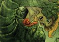
    There is something about it. Something around the eyes.

    No. I’m sure of it. I hate it.

    Reply
    • marco says:
      9 years ago

      Exactly, the ikd logo was perfect for the atmosphere of the comic, with this new “modern” logo, the conic loses his spirit

      Reply
  43. sherry Krautschun says:
    9 years ago

    I like the old one

    Reply
  44. mokie says:
    9 years ago

    I love the old logo…. But the covers pre 100 (simple ones like 48 with the red black contrast) and even some of the moore covers will hold a special place to me as i own a majority of the run and am always buying / selling them and i don’t look at issues 104 or 108 and think anything looks off or wrong either.

    This looks amazing on #127 and i can imagine 128 & 129 as well. I don’t understand why the change and i believe it does look cleaner and more modern….. but less The Walking Dead and i don’t know if that’s a good change or not yet after AoW and what a disappointment that was over-hyped to be.

    Reply
  45. Guest says:
    9 years ago

    Well on my facebook page I asked which one they liked more and It was about 15-2 (15 like the old cover and 2 like the new cover

    Reply
  46. Josh says:
    9 years ago

    Well on my Facebook page I asked which one they liked more and It was about 15-2 (15 like the old cover and 2 like the new cover) I also like the old look cover

    Reply
  47. Bingo Bango Bongo says:
    9 years ago

    BOOO this looks like crap. Switch back to the old style please (1-114)

    Reply
  48. Kimberli says:
    9 years ago

    Why not have them both , you can choose which one when you order. It would be great for the collector, as well as the reader!

    Reply
  49. Bingo Bango Bongo says:
    9 years ago

    Boooooooo

    Reply
  50. rob milam says:
    9 years ago

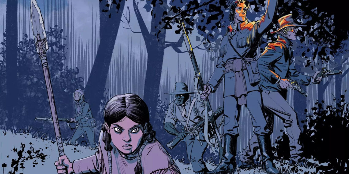
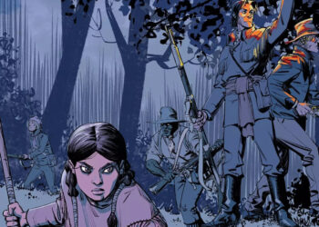
    Does anyone else think that this new beginning could be___ The daughter of Maggie all grown up in the same world and zombies still run the earth…….

    Reply
  51. Glenn24Rhee says:
    9 years ago

    I really hope hes not throwing away the characters and starting a new story. If these are characters we already know, then here are my guesses. The main girl probably Rosita or Maggie. To her right Eugene, to his right Gabriel, and to his right a short haired Paul or maybe Rick. To the main girls left, if it’s Maggie then the girl is her and Glenn’s daughter; showing a time jump. If it’s Rosita then the girl is Maggie. Finally, the big man in the back is a shaved headed Heath, his shoulder on one side is lower. Possibly he is limping because of his missing leg and having to wear a peg leg.

    Reply
  52. Helena A. says:
    9 years ago

    I loved the old logo and I don’t like the look of this new one. Who the hell are these new people? I want Rick, Michonne, Andrea, Jesus, and Carl!

    Reply
  53. Jason Westerman says:
    9 years ago

    I do NOT like the new covers!!!!! I like the All Out War covers the best, but they are pretty close to the original! The new logo is just too small! Kirkman please bring back the “AOW” covers!! They look much better!

    Reply
  54. Ronny Haze says:
    9 years ago

    Love the new Logo, don’t get me wrong, the old Logo was great but with the end to “AOW” and picking up a year or two later with Rick having a complete physical makeover and looking like a “new” hero, also Carl got a new look, Negan’s hair has grown out giving us an idea of time passed, the “village” is new in how it is prosperous and we get new characters with a story line that feels like a whole new story is developing… it just felt right for the outside of the comic to take on a new look when the inside is doing the same. It also makes all the issues that came before it, even more important to collectors.

    Reply

Leave a Reply Cancel reply

Your email address will not be published. Required fields are marked *

Latest

Invincible Collectible Art Print

Grab These Walking Dead and Invincible Collectible Art Prints This Week at PAX East!

March 20, 2023
Your First Look at the Return of Joshua Williamson’s Dark Ride!

Your First Look at the Return of Joshua Williamson’s Dark Ride!

March 16, 2023
First Look: Kroma by Lorenzo De Felici Reaches Its Visceral Conclusion

First Look: Kroma by Lorenzo De Felici Reaches Its Visceral Conclusion

March 14, 2023
Skybound Hits PAX East with WrestleQuest, Glitch Busters: Stuck on You, Vice NDRCVR, and Homestead Arcana

Skybound Hits PAX East with WrestleQuest, Glitch Busters: Stuck on You, Vice NDRCVR, and Homestead Arcana

March 10, 2023
GIGI CAVENAGO VARIANT COVERS UNVEILED FOR KROMA BY LORENZO DE FELICI SERIES FINALE

GIGI CAVENAGO VARIANT COVERS UNVEILED FOR KROMA BY LORENZO DE FELICI SERIES FINALE

March 9, 2023
Follow @skybound Tweet to @skybound Tweets by Skybound
  • afterschool
  • assassin-nation
  • baldurs-gate
  • battle-pope
  • battle-pope
  • big-con
  • birthright
  • brit
  • callisto-protocol
  • clementine
  • clone
  • creepshow
  • crude
  • cuphead
  • dark-ride
  • dead-body-road
  • deaths-gambit
  • die-die-die
  • disco
  • the-electric-state
  • escape-academy
  • everyday-herd
  • excellence
  • extra-fabulous
  • extremity
  • fear-the-walking-dead
  • fire-power
  • gasolina
  • ghosted
  • glitch-busters
  • grimm-forest
  • grimm-masquerade
  • guardians-call
  • guarding-the-globe
  • hardcore
  • heart-attack
  • homestead
  • icewind-dale
  • hate-this-place
  • invincible
  • invincible-universe
  • kroma
  • last-man
  • the-labrynth
  • the-long-dark
  • manifest-destiny
  • murder-falcon
  • mr-lovenstein
  • neverwinter-nights
  • notmycar
  • oblivion-song
  • the-obsoletes
  • outcast
  • outer-darkness
  • outpost-zero
  • pitchstorm
  • planescape-torment
  • rainbow-billy
  • redneck
  • the-walking-dead-saints-and-sinners
  • science-dog
  • scurry
  • sea-serpent-heir
  • six-sidekicks
  • skull-girls
  • skybound-x
  • slime-rancher
  • the-walking-dead-something-to-fear
  • sorcerer-city
  • stealth
  • stillwater
  • stray
  • superfight
  • tech-jacket
  • the-walking-dead
  • the-walking-dead-last-mile
  • telltales-the-walking-dead
  • thief-of-thieves
  • tidal-blades
  • trial-by-trolley
  • vice
  • wrestle-quest

READ

About
Comics
Games
TV / Movies
Podcasts

SHOP

Games
Clothing
Accessories
Comics & Books
Toys & Collectibles

LEARN

Robert Kirkman
Contact
Privacy Policy
Terms & Conditions
Careers

© 2023 Skybound, LLC and/or its affiliates. The Skybound mark and any related logos are trademarks of Skybound, LLC

  • Login
  • About
  • Comics
  • Games
  • TV & MOVIES
  • Shop
  • Podcasts

Forgotten Password?
Don't have an account yet?
Sign Up
Copyright © 2018 All Site Content and © 2018 SKYBOUND, unless otherwise noted here. All Right Reserved.

Fill the forms bellow to register

Cancel
Already have an account?
Log In
All fields are required.

Retrieve your password

Please enter your username or email address to reset your password.

Log In